
DOW ChemicalThe Lab Safety Management Platform
The lab safety management process ensures the safety of over 1,500 researchers at DOW.
In this case study, I have excluded and disguised sensitive information. The content presented here represents my personal work and does not necessarily represent the opinions or perspectives of DOW Chemical.
The Challenge
Ensuring laboratory safety is paramount for researchers, with all research chemists required to complete this process before initiating any new experiments. Dow acknowledged the necessity of digitizing and streamlining these fragmented procedures. However, over the past two years, the client team faced challenges in progressing due to difficulties in gathering requirements, establishing a product development process, and managing content across 600+ prompts.
My Role
As the solo product designer, I was pivotal in resetting the client's expectations regarding the product development process and the Avanade team's role in the project. I led open discussions with the client team to gain deeper insight into their challenges and proposed a collaborative environment for efficient requirement gathering. I owned the end-to-end design process, which encompassed formulating the UX strategy, creating low to high-fidelity wireframes, UI design, prototyping, and ensuring a seamless hand-off to development.
Previous Process

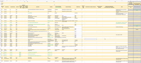
We started with an Excel sheet
Only the PO had access to end-users. The Avanade team had to work with an Excel document with 600+ rows of data as the primary reference for requirements. However, understanding this document was challenging as it was solely comprehensible to the Product Owner.


Finding Ways to Collaborate
I began by dissecting the Excel sheet, grouping related prompts, and outlining high-level workflows. I established frequent touchpoints with stakeholders to gather detailed design requirements, including the main clients: The Product Owner (PO) and the lead developer. I created low-fidelity wireframes at each touch point in real-time to help the clients visualize their ideas.
The power of visualization proved to be robust and intuitive. The client was delighted with the progress as solid ideas materialized through detailed wireframes. After four months of dedicated effort, we successfully defined relationships among five user groups and over 600 prompts.
Phase 1


Phase 2
Phase 3

Final Wireframes


Finding the Information Hierarchy
The key to successful product design was creating a navigation system that fulfilled two crucial requirements:
1. Streamlining the organization of 600 prompts.
2. Strategically placing features that require constant visibility.
After several iterations, we developed five distinct navigation systems. We determined their positioning based on their respective functions, and through color contrast, we established a clear hierarchy among them. This approach significantly reduced the perceived complexity of the navigation options for users.

Final Design
Takeaways
For a client who initially equated UX designers with visual designers, this project began as a challenging endeavor, starting with explaining the importance of UX and a systematic product development approach. We embarked on this project without any prior UX support.
However, within seven months, we provided solutions to problems the client had struggled with for two years, delivering a satisfactory outcome to all involved.
When I delivered the final UI design to the development team, the client recognized the value of UX research, which could have spared the guesswork in gathering requirements and better positioned the team for success.